4 ways to make your website highly converting

Converting websites are designed to turn visitors into customers. These sites are optimized for user experience and conversion, with the goal of encouraging visitors to take a specific action, such as making a purchase or filling out a contact form.
To achieve this goal, converting websites often utilize several key design and marketing strategies.

1 - Clear Value Proposition
First, they have a clear and compelling value proposition, which is a statement that communicates the unique benefits of the product or service being offered. This value proposition is prominently displayed on the homepage and throughout the site, helping visitors quickly understand what the site is all about and why they should take action. It is a crucial element of any website as it helps visitors understand what the site is all about and why they should take action.
A good value proposition should be specific, unique and relevant to the target audience. It should clearly communicate the benefits of the product or service, and how it addresses a pain point or solves a problem for the customer. It should be prominently displayed on the homepage and throughout the site, making it easy for visitors to understand the value that the site offers.
For example, an e-commerce website selling eco-friendly products might have a value proposition like "Shop for sustainable and ethically-made products that help you reduce your environmental impact." This statement tells visitors the benefits of the products being sold, and the values that the company holds.
In summary, a clear and compelling value proposition is an essential element of converting websites as it helps visitors quickly understand what the site is all about, and why they should take action, thus increasing the chances of conversion.

2 - Better Design
Second, converting websites use persuasive design elements, such as persuasive copy, social proof, and trust badges, to build trust and credibility with visitors. Persuasive design elements are design and marketing techniques that aim to overcome objections and encourage visitors to take action.
One of the most common persuasive design elements is persuasive copy, which is the use of persuasive language and messaging throughout the website. This can include headlines, product descriptions, and calls to action. Persuasive copy should be written in a way that addresses the visitor's needs, concerns and objections and presents clear benefits of the product or service.
Another persuasive design element is social proof, which is the use of customer testimonials, reviews, and ratings. Social proof helps to build trust by showing visitors that other people have had positive experiences with the product or service. Trust badges, such as security seals, awards or certifications, can also be used to demonstrate the credibility of the website.
In addition to building trust, persuasive design elements also help to guide visitors towards taking action. For example, using action-oriented language in calls to action (CTA) such as "Buy Now" or "Sign Up" can encourage visitors to take the next step.
To sum up, persuasive design elements such as persuasive copy, social proof, and trust badges help to build trust and credibility with visitors, overcome objections and guide them towards taking action, thus increasing the chances of conversion.

3 - Call-To-Action's That Stand Out
Third, converting websites use clear and prominent calls to action (CTAs), which are buttons or links that encourage visitors to take a specific action, such as "Buy Now" or "Contact Us." They are an essential element of converting websites as they guide visitors towards the desired action.
One of the most important aspects of CTAs is that they should be clear and prominently placed throughout the site. This means that they should be easy to find and understand, and should stand out from the rest of the content on the page. They should also be action-oriented, using language that encourages visitors to take the next step.
In addition, it's important to use multiple CTAs throughout the site, not just on the homepage. This allows visitors to take action at different stages of the conversion process, whether they're just learning about the product or service, or are ready to make a purchase.
Another important consideration for CTAs is their placement. CTAs should be placed in strategic locations on the page such as above the fold, near related content or in the middle of a long form. Also, it's important to test different versions of CTAs to see which performs better, this is where A/B testing comes in handy.
In summary, clear and prominent calls to action are an essential element of converting websites as they guide visitors towards taking the desired action. They should be clear, prominently placed, action-oriented and in strategic locations throughout the site. Testing different versions of CTAs can also help optimize conversion rates.

4 - A/B Testing
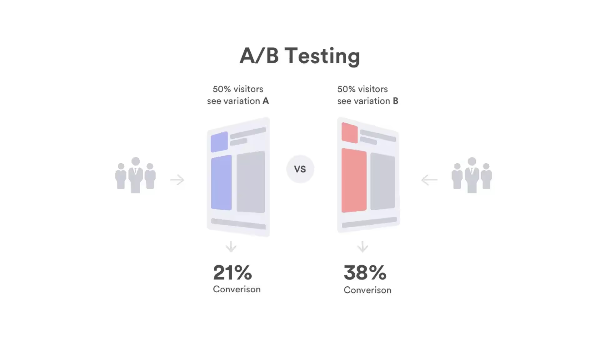
The fourth key strategy that converting websites use is A/B testing. A/B testing is a method of comparing two versions of a webpage to see which one performs better in terms of conversion rate. By using A/B testing, website owners can make data-driven decisions about how to optimize their website for conversion.
A/B testing typically involves creating two versions of a webpage, and then randomly showing them to different groups of visitors. The results of the test are then used to determine which version performed better in terms of conversion rate.
For example, a website owner might create two versions of a product page, one with a large image of the product and one with a smaller image. They would then randomly show these two versions to different groups of visitors and measure the conversion rate for each version. If the version with the large image had a higher conversion rate, the website owner would know that they should use larger images on their product pages moving forward.
A/B testing can be used to test a wide range of elements on a website, such as headlines, calls to action, images, and layout. By continuously testing and optimizing different elements of the website, website owners can improve their conversion rates over time.
In summary, A/B testing is a powerful strategy for optimizing converting websites. By comparing two versions of a webpage and measuring their conversion rates, website owners can make data-driven decisions about how to optimize their website for conversion. Continuous testing and optimization can help improve conversion rates over time.
Overall, converting websites are designed to maximize the number of visitors who take a desired action, such as making a purchase or filling out a contact form. By using a clear value proposition, persuasive design elements, prominent calls to action, and A/B testing, converting websites can effectively guide visitors towards taking action and turning into customers.


